Canvas Guides3 min read
Framed or Frameless Canvas? Finding Your Kind of Finish
A decorative frame changes the mood of a picture. Here is how to choose the finish that feels right for your room.
Read story
Use one artwork to connect colours across a room, without making every object match.

An animal canvas has more to offer a room than its subject. The backdrop, fur, clothing and small props create a ready-made collection of colours. You can borrow one or two of them to help the artwork feel at home.
This does not mean turning the whole room into the picture. A few quiet connections are usually more convincing than a complete matching set.
Look at the largest surfaces first: walls, floor, sofa and cupboards. Those colours are harder to change than a cushion or a mug. Choose an artwork that sits comfortably with them, then decide whether you want a soft blend or a stronger contrast.
A warm wood floor and cream walls make a natural setting for golden fur and terracotta. Darker furniture can work well with a deep teal background. These are starting points, not rules; test the colours in your own light.
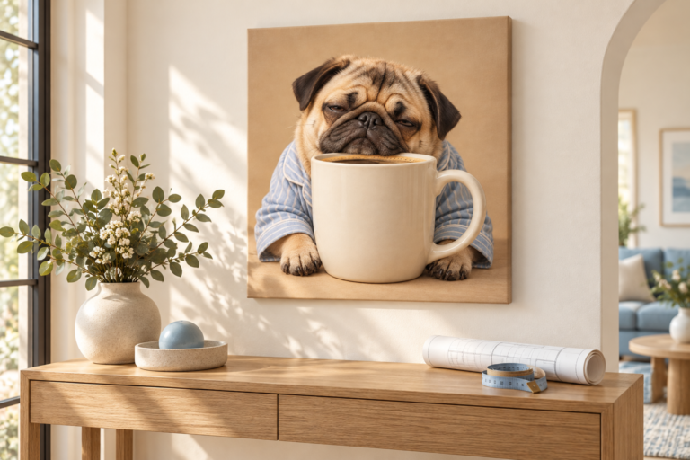
The terracotta backdrop in The Croissant Critic can be echoed by a small ceramic bowl, a cushion or a muted textile. You do not need a terracotta wall as well. Let the picture hold the strongest version of the colour.
For a gentler effect, borrow a secondary detail instead. An olive-green cup or a cream plate can connect the print to the room while the bold background remains the focal point.
Warm white, pale grey, natural timber and simple linen textures can keep an expressive artwork from feeling busy. A neutral wall makes the canvas outline and shadow easier to read. It also gives you more freedom to change accessories later.
If your room already contains several patterns, clear the area immediately around the artwork. One calm patch of wall can be enough to make the whole arrangement feel more settled.
A colour can look cooler in morning shade and warmer under an evening lamp. Look at your chosen wall in both conditions. Screens and printed materials also show colour differently, so treat a digital preview as a guide rather than an exact colour sample.
Do not place the canvas in prolonged direct sunlight just to brighten a dark corner. Consider the room’s lighting and a more suitable wall position instead.
Try choosing a dominant room neutral, one colour borrowed from the canvas and one supporting material such as wood or metal. This keeps the decisions manageable. If a new accessory does not strengthen the connection, it may not be needed.
For several canvases together, repeat one colour across the group rather than forcing identical backgrounds. Our gallery wall guide shows how to mix characters while keeping the overall arrangement calm.
A decorative frame changes the mood of a picture. Here is how to choose the finish that feels right for your room.
Read storyMeasure the space, test the outline and choose a scale that gives the animal—and the joke—room to breathe.
Read storyThe shape of a canvas affects both the composition and the wall around it. Here is what to look for when switching sizes.
Read story